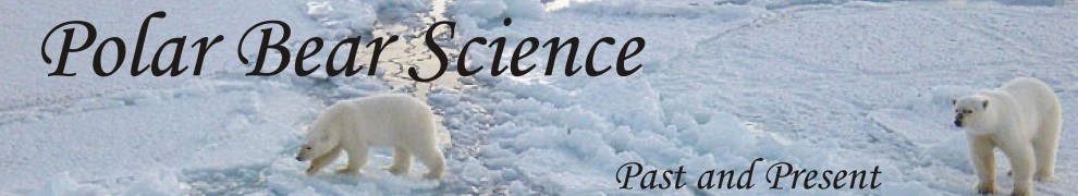
Polar bear biologists Ian Stirling and Andrew Derocher continue to insist that western Hudson Bay (WHB) polar bears are already showing negative effects of reduced sea ice due to global warming. In their 2012 summary paper (Stirling and Derocher 2012), they updated someone else’s graph of global sea ice (to 2011) but used a graph for Hudson Bay (HB) ice breakup dates that ended in 2007. However, we know from other evidence that at least one of those years (2009) would have required extending the scale of the breakup date graph upwards and flattened the slope of the trend line. Updating the HB breakup date graph would not have supported Stirling and Derocher’s premise that polar bears in WHB are starving due to increasingly earlier sea ice breakup, so they simply left the data out (see Fig. 1).
In other fields, this is called fraud.
Is it fraud here? You decide.
I’ve expressed my outrage about this before (here and here), because we know from news reports that in 2009, breakup of Hudson Bay sea ice was unusually late: the Port of Churchill (in WHB) did not open for ship traffic until Aug. 12, a full three weeks later than average (July 21) – and the latest opening of the Port since records began in 1974.
I try not to keep thinking of Stirling and Derocher’s unscientific behaviour but was reminded of it again on Monday (March 4) when I attended a lecture at the University of Victoria given by paleoclimatologist Michael Mann. To my disbelief, Mann tried to argue that global temperatures predicted by NASA scientist James Hansen in 1988 have “closely resembled” actual temperatures since then – by presenting a graph of actual temperatures (observations) that ended in 2005, despite the fact that recent temperatures have not risen at the rate depicted in his graph (see previous post, #8). He did say, as an aside, that “you could argue that if the data were extended out to the present, the line might more closely resemble scenario C [a flat line]” but then continued with his story that observations were matching the ever-rising-temperatures of Hansen’s scenario B (see Figure 2 below).
For both parties – Stirling/Derocher and Mann – the recent data points left off their graphs did not fit their narrative: sea ice in Hudson Bay is not on a steady, precipitous decline and global temperatures have not continued to rise as predicted by Hansen in 1988. The graphs look like science, but they are not.
Figure 1. Sea ice graphs from Stirling and Derocher (2012: figs. 2 and 3): both appear on page 2696. The global sea ice graph (top) is from another author (Stroeve et al. 2007) but has been updated to 2011 and annotated to draw attention to that fact. The graph on the bottom depicts the calculated dates of ice breakup on Hudson Bay, originally from a former Stirling paper (Stirling et al. 1999) and much more relevant to western Hudson Bay polar bears than patterns of global sea ice – but has not been updated. The truncation of the breakup date graph at 2007 conveniently leaves out the late breakup data point for 2009, which would almost certainly flatten the trend line.
Breakup dates for Hudson Bay are not something you can look up on the Canadian Ice Service (CIS) website. “Breakup,” as used in the scientific literature, is a calculated date. It is defined as the point where 50% of the bay is ice-free, determined from a point-by-point calculation over a grid. Stirling has chosen to use passive microwave data supplied daily by NASA for his recent graphs rather than the weekly CIS ice charts (see Stirling and Parkinson 2006; for a discussion of the weekly method, Scott and Marshall 2010).
It is virtually certain that adding a data point for 2009 would make Stirling and Derocher’s trend line flatten; the Y-axis of the graph, which ends in this version at 31 July (Fig. 1), would almost certainly need to be extended into Aug to accommodate the 2009 date. See my discussion of a virtually identical figure that appears in Stirling’s new (2011) polar bear book, reviewed here.
I call this omission of data a shameful misrepresentation of fact. It is not how science should be done. In my opinion, Stirling and Derocher’s trick with their sea ice graph is no different from Mann’s trick of truncating his temperature graph: both hide the fact that recent data are no longer supporting their story. And it appears I am not alone in thinking there is more to these incidents than that these guys are just lazy.
There has been outrage recently over Mann’s use of out-of-date graphs here. Statistician Steve McIntyre draws attention to a scathing critique of a paper published in 2007 that did something very similar:
In a 2007 realclimate article, Raymond Pierrehumbert condemned use of non-updated temperature data, when the effect of the failure to use up-to-date data was that the image gave an entirely different impression to the reader. In that situation, Pierrehumbert even called into question the ethics of the author.
[said Pierrehumbert] “…there is no legitimate reason — in a paper published in 2007 — for truncating the temperature record at 1992 as they did. There is, however, a very good illegitimate reason, in that truncating the curve in this way helps to conceal the strength of the trend from the reader, and shortens the period in which the most glaring mismatch … occurs.”

Figure 2. Michael Mann’s graph of “observed” global temperatures vs temperatures predicted by NASA scientist James Hansen back in 1988, which conveniently leaves out recent temperatures that do not fit Mann’s story that “recent temperatures are rising as Hansen predicted.” This slide is taken from a presentation given by Mann at Rutgers University in September 2012 and is the same one given at the AGU meeting in December 2012 and in Victoria, on March 4, 2013, which I saw with my own eyes. See ClimateAudit for a full discussion.
It seems I have a great deal of company in finding this kind of behavior appallingly unethical and unscientific. Anyone who is outraged by this suggestion should ask Stirling and Derocher to publish an updated graph of Hudson Bay breakup dates – show me I am wrong in assuming that adding 2009 would change the slope of their trend line.
References
Scott, J.B.T. and Marshall, G.J. 2010. A step-change in the date of sea-ice breakup in western Hudson Bay. Arctic 63:155-164. Available here (open access) http://arctic.synergiesprairies.ca/arctic/index.php/arctic/issue/view/55
Stirling, I. 2011. Polar Bears: The Natural History of a Threatened Species. Fitzhenry & Whiteside.
Stirling, I. and Derocher, A.E. 2012. Effects of climate warming on polar bears: a review of the evidence. Global Change Biology 18:2694-2706. doi:10.1111/j.1365-2486.2012.02753.x
Stirling, I., Lunn, N.J. and Iacozza, J. 1999. Long-term trends in the population ecology of polar bears in Western Hudson Bay in relation to climate change. Arctic 52:294-306.
http://arctic.synergiesprairies.ca/arctic/index.php/arctic/article/view/935/960
Stirling, I. and Parkinson, C.L. 2006. Possible effects of climate warming on selected populations of polar bears (Ursus maritimus) in the Canadian Arctic. Arctic 59:261-275. http://arctic.synergiesprairies.ca/arctic/index.php/arctic/issue/view/16.
Stroeve, J., Holland, M.M., Scambos, T. and Serreze, M. 2007. Arctic sea ice decline: faster than forecast. Geophysical Research Letters 34: L09501, doi:10.1029/2007/GL029703.


You must be logged in to post a comment.