A new collaboration by sea ice and polar bear specialists that predicts a catastrophic future for polar bears in Hudson Bay (Stroeve et al. 2024) can be dismissed as yet another bit of utterly useless fearmongering for two reasons: 1) it’s a model projection that uses widely discredited SSP5-8.5 “business as usual” climate scenarios for its predictions; and 2) it’s based on the false premise that Western and Southern Hudson Bay polar bears have already suffered harm from reduced sea ice blamed on fossil fuel-caused global warming.
The fact that recently-deceased Ian Stirling was a prominent co-author should come as no surprise: his irrational promotion of the idea that future “climate warming” could doom polar bears to near-extinction – even after recording and publishing evidence to the contrary – will go down in history as an appalling violation of scientific principles.
Adding to the dubious validity of the paper: lead author Julienne Stroeve’s 2007 paper predicting summer sea ice decline by 2050 was proven wrong by actual data by the time it was published (Stroeve et al. 2007, 2014) and a more recent update failed to foresee the recent 17-year stall in decline. And co-author Steve Ferguson, a seal biologists, rashly stated in 2016 that Hudson Bay could be ice-free in winter as early as 2021 [which, needless to say, never came close to fruition].
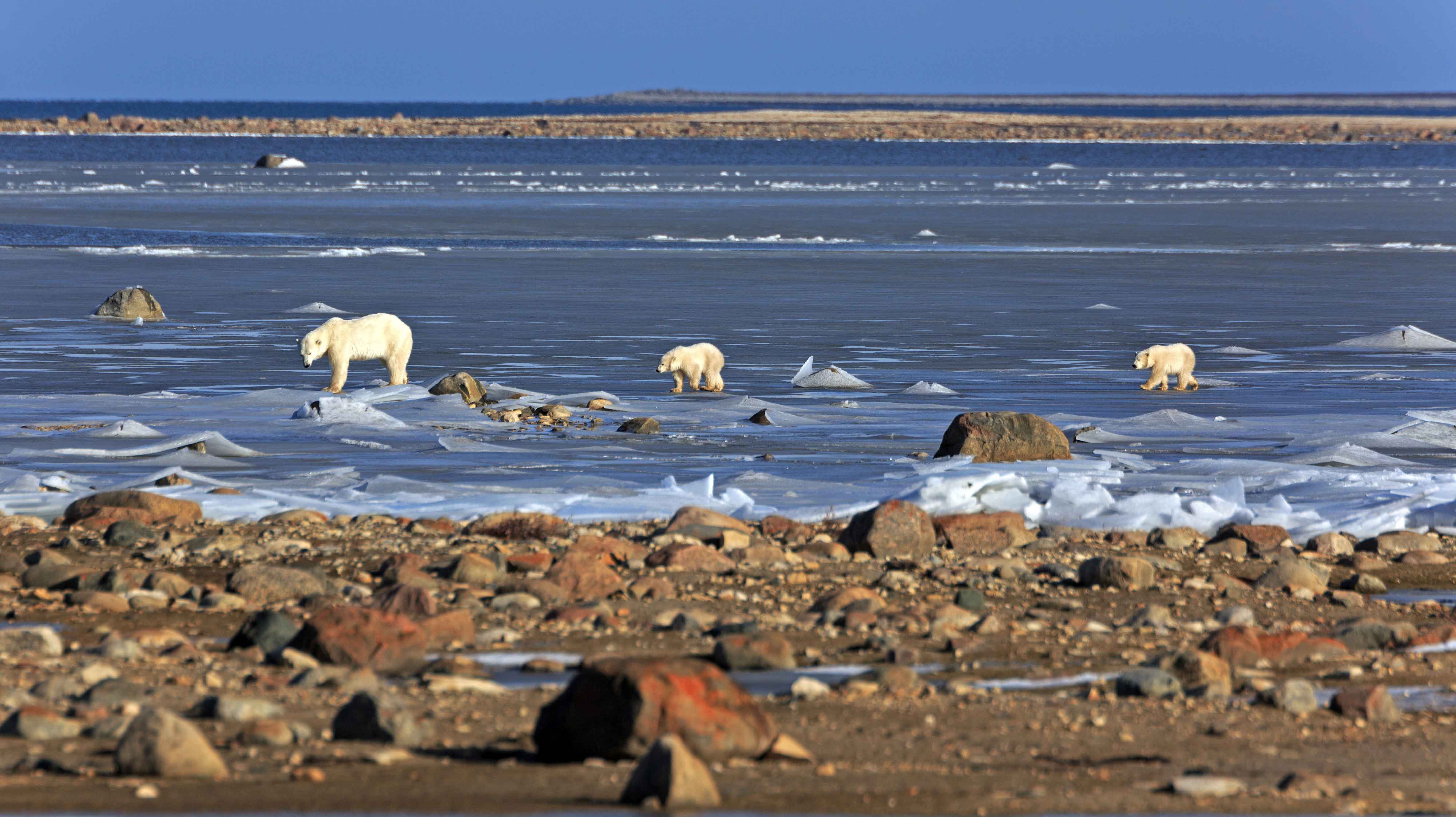
I’d say if Southern Hudson Bay polar bears might be extirpated as soon as 2030, as the paper’s co-author Alex Crawford suggests, the global temperature and ice melt had better get a move on: a survey showed the SH population was thriving in 2021 and Hudson Bay sea ice hasn’t hit any kind of death spiral in the three years since.
Continue reading


You must be logged in to post a comment.