
“The Arctic” is a bit hard to define. While the Arctic Circle works as a good boundary for some purposes and the 100C isotherm for July for others, neither work for polar bears because several subpopulations live well south of these limits (Fig. 1).
In the east, Western Hudson Bay, Southern Hudson Bay and Davis Strait are all located well south of the Arctic Circle and the first two (and half of Davis Strait) are beyond the 100C July isotherm as well. In the western Arctic, the Chukchi Sea subpopulation is within the 100C July isotherm but at least half of its bears reside south of the Arctic Circle (Fig. 1) in the Bering Sea (see previous post here).
Unique amongst all of these is Southern Hudson Bay – all of its polar bears make maternity dens and/or spend the summer south of 600N.
Southern Hudson Bay (SH) bears live in the Canadian provinces of Ontario, while Western Hudson Bay (WH) bears reside in Manitoba and Nunavut. The two groups mix over the winter but appear to spend the summer/fall in their respective regions (Stirling et al. 2004). [See previous posts on Western Hudson Bay bears here, here, and here]
“Further south” in the Arctic usually means warmer, with open water present more weeks every summer, sea ice for fewer weeks over the winter. So, shouldn’t the bears of Southern Hudson Bay be already suffering more harm from global warming than virtually all other subpopulations, including those in Western Hudson Bay?
After all, Western Hudson Bay bears appear to have experienced a statistically significant decline in numbers, among other effects (Regehr et al. 2007; Stirling and Derocher 2012) — surely Southern Hudson Bay bears are doing worse?
You’d think so, but they aren’t.
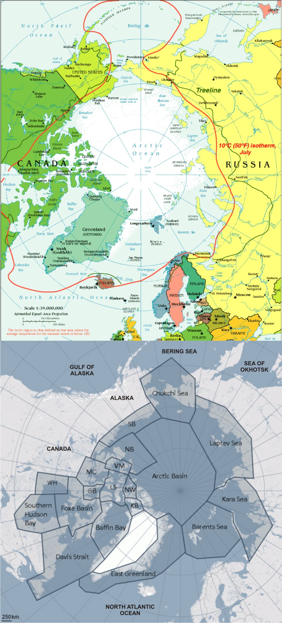
Figure 1. Boundary limits for “the Arctic” (top map) such as the Arctic Circle (dashed line) or the 100C isotherm for July (solid red line) would not include several polar bear subpopulations that live south of these.
UPDATED October 28, 2014: Reference added, Obbard et al. 2013 (aerial survey results).
Continue reading


You must be logged in to post a comment.