Tag Archives: Cryosphere Today

Baffin Bay-Davis Strait ice concentration comparison – why use the “summer mean”?

I’ve been in the process of looking at the status of polar bears in the Baffin Bay region, which lies to the north of Davis Strait (Fig. 1), but a related issue caught my attention that I think deserves discussion.
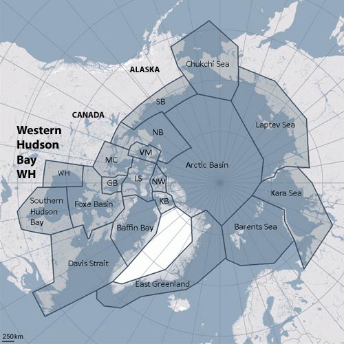
Figure 1. Polar bear subpopulations defined by the Polar Bear Specialist Group (PBSG). Note that Baffin Bay, Davis Strait, Western Hudson Bay and Southern Hudson Bay are all similar in that they become ice-free by early fall (the September minimum) or before.

Figure 1. Polar bear subpopulations defined by the Polar Bear Specialist Group (PBSG). Note that Baffin Bay, Davis Strait, Western Hudson Bay and Southern Hudson Bay are all similar in that they become ice-free by early fall (the September minimum) or even before.

Recall that in a recent post on the Beaufort Sea ice extent comparison offered by the National Snow and Ice Data Center (NSIDC) here, I commented:

What puzzled me was why they featured only the last 7 years when satellite data go back to at least 1979. Is there something in that data they don’t want us to see?”

Something similar struck me about the analysis of sea ice in Baffin Bay and Davis Strait conducted by polar bear researchers Karyn Rode and colleagues (Rode et al. 2012). In their comparison of body condition (relative fatness) of bears in Davis Strait and Baffin Bay (see previous post here), they introduced an entirely new sea ice metric – “mean daily summer sea ice concentration,” defined as the mean of values between May 15 and October 15 each year based on ice charts provided by the Canadian Ice Service.

Why invent a metric that has never been used (as far as I know) for analysis of polar bear health, survival or success?

Why not use breakup dates, as has been done for decades for subpopulations in Hudson Bay (e.g. Cherry et al. 2013), where the ice also disappears in late summer?

Is there something in the ice data for Baffin Bay and Davis Strait that Rode and colleagues don’t want us to see?

Since I had already made a composite of Cryosphere Today ice maps at July 12 for my discussion of the Chukchi/Beaufort NSIDC analysis mentioned above, it was relatively easy to look at what was going on in Baffin Bay and Davis Strait on that date in mid-summer. Keep in mind that ice extent and concentration at July 12 records the state of polar bear habitat prior to the late summer decline in sea ice that occurs every year.

Continue reading

Chukchi-Beaufort ice extent comparison – why feature only the last 7 years?

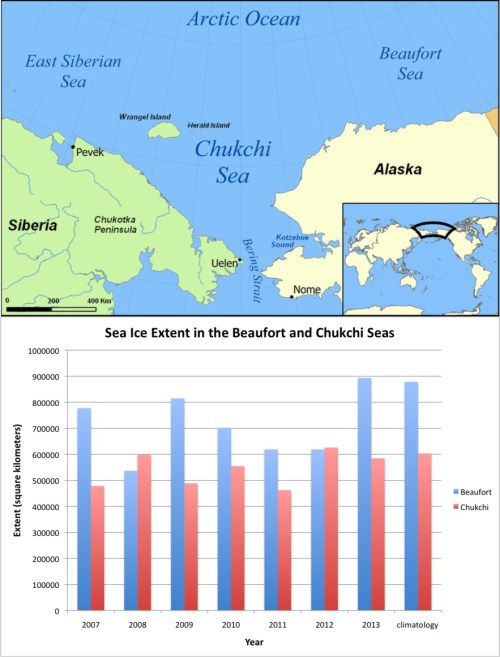
The most recent issue of Arctic Sea Ice News provided by the National Snow and Ice Data Center (NSIDC) – the official US keeper of sea ice data – (July 17, 2013) included an interesting graph of sea ice extent in the Chukchi and Beaufort Seas at July 12.

They present the data for 2007 to 2013, compared to the new 30 year average1, and note that the Beaufort Sea had “the most extensive ice cover seen there in the last seven summers.” It is also clear from their graph that the 2013 extent was virtually identical to the average in both regions (Fig. 1).

Figure 1. Graph of sea ice extent at July 12 each year from 2007 to 2013 from the National Snow and Ice Data Center, NSIDC. “Climatology” (last set of bars) is the 30 year average (1981-2010) extent at this date.1 In 2013, the Beaufort Sea had “the most extensive ice cover seen there in the last seven summers” (NSIDC). It is also clear from the graph that the 2013 extent was virtually identical to the 30-year average. Map from Wikipedia. Click to enlarge.

Figure 1. Graph of sea ice extent at July 12 each year from 2007 to 2013 from the National Snow and Ice Data Center, NSIDC. “Climatology” (last set of bars) is the 30 year average (1981-2010) extent at this date.1 It is clear from the graph that the 2013 extent was virtually identical to the 30-year average. Map from Wikipedia.

What puzzled me was why they featured only the last 7 years when satellite data go back to at least 1979. Is there something in that data they don’t want us to see?

There is no similar data in graph form available that I could find but there is the wonderful comparative sea ice mapping tool provided by Cryosphere Today, operated by the University of Illinois.

So, in the absence of numerical data to compare to the Fig. 1 graph, I chose visual data to ask the question: what could there be about the long-term record of Chukchi/Beaufort sea ice data that the NSIDC might not want us to know?

The ice coverage at mid-summer (July 12) provides a snapshot of what sea ice  conditions are like for polar bears before the summer melt season gets into full swing, so this historical perspective is quite revealing. [See previous posts here, here, and here for more on Chukchi/Beaufort polar bears.]
Continue reading