Tag Archives: timeline

Latest global polar bear abundance ‘best guess’ estimate is 39,000 (26,000-58,000)

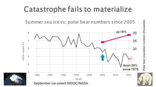
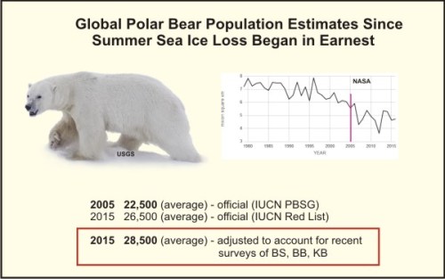
It’s long past time for polar bear specialists to stop holding out for a scientifically accurate global estimate that will never be achieved and determine a reasonable and credible ‘best guess’. Since they have so far refused to do this, I have done it for them. My extrapolated estimate of 39,000 (range 26,000-58,000) at 2018 is not only plausible but scientifically defensible.

Polarbear1_wikimedia_Andreas Weith photo Svalbard sm

In 2014, the chairman of the IUCN Polar Bear Specialist Group (PBSG) emailed me to say that their global population size number ‘has never been an estimate of total abundance in a scientific sense, but simply a qualified guess given to satisfy public demand.’

In my new book, The Polar Bear Catastrophe That Never Happened, I contend that this situation will probably never change, so it’s time to stop holding out for a scientifically accurate global estimate and generate a reasonable and credible ‘best guess’. Recent surveys from several critical polar bear subpopulations have given us the information necessary to do this.

UPDATE: I have made this a sticky post for a while: new posts will appear below.

Continue reading

Global polar bear population size is about 28,500 when updates are included

Polar bear numbers have risen since 2005, no matter how you look at it:

Svalbard polar bear Jon Aars_Norsk Polarinstitutt

USGS estimated 24,500 (average) polar bears in 2005.

IUCN estimated 26,500 (average of 22,000-31,000) in 2015
(assessment completed in July, released in November).

Subpopulation surveys completed or reported after July 2015 (Baffin Bay, Kane Basin, Barents Sea) added ~2,000 bears.

This brings the adjusted average total at 2015 to ~28,500.

This may not be a statistically significant increase but it is also not the catastrophic decline that was predicted to occur in association with the abrupt drop of summer sea ice in 2007 to a new average of about 3-5 mkm2 [updated 1 June 2017].

Crockford 2017_Slide 12 screencap

Explained in full in this published paper, pgs 20-21:

Crockford, S.J. 2017 V3. Testing the hypothesis that routine sea ice coverage of 3-5 mkm2 results in a greater than 30% decline in population size of polar bears (Ursus maritimus). PeerJ Preprints 2 March 2017. Doi: 10.7287/peerj.preprints.2737v3 Open access. https://doi.org/10.7287/peerj.preprints.2737v3

UPDATE 26 March 2019: See “Latest global polar bear abundance ‘best guess’ estimate is 39,000 (26,000-58,000)

Global polar bear population larger than previous thought – almost 30,000

The results of three recently-released studies that were not included in the last IUCN Red List assessment add more than 2,050 bears (on average)1 to the official 2015 global polar bear estimate, a point you won’t likely hear next Monday (27 February) from most polar bear specialists, conservation organizations, their cheerleaders and corporate sponsors on International Polar Bear Day.

global-pb-population-size-graphic2_2017-feb-polarbearscience-corrected

This means the adjusted 2015 global estimate for polar bears should be about 28,500 (average), a marked increase over the official estimate of 26,500 (average) for 2015 — and an even larger increase over the 2005 estimate of about 22,500 (average)2, despite the dramatic loss of summer sea ice since 2007 that we hear about endlessly.

It is increasingly obvious that polar bears are thriving despite having lived through summer sea ice levels not predicted to occur until 2050 – levels of sea ice that experts said would wipe out 2/3 of the world’s polar bears (Amstrup et al. 2007; Crockford 2017 v3).

Update 26 March 2019: see “Latest global polar bear abundance ‘best guess’ estimate is 39,000 (26,000-58,000)

Updated 1 June 2017:  see addition to Footnote 2.
Continue reading

Graphing polar bear population estimates over time

I’ve already commented on the 2013 update of polar bear population status released by the IUCN Polar Bear Specialist Group (PBSG).

However, I thought it might be interesting to graph the changes in global population estimates over time (from 1981-2013) — not just the actual estimates from PBSG status tables (with their min/max error ranges) but those totals plus the so-called “inaccurate” estimates that the PBSG have dropped from their accounts in recent (2005-2013) assessments: Chukchi Sea, East Greenland, Queen Elizabeth Islands (now known as the “Arctic Basin”), and Laptev Sea.

In 2001, those “inaccurate” estimates contributed 5,000-5,400 bears to the global total, but now they’re gone — no bears from those regions contribute to the official totals listed on recent PBSG status tables.

Adding those dropped estimates back into the global totals makes it possible to generate a graph in which the global estimates are truly comparable over time.

To see how the dropped estimates influenced the perception of population change over time, I’ve also graphed the estimates given by the PBSG in their status tables. I’ve combined the two into one image (Fig. 1, click to enlarge) to make comparison easy.

UPDATE 5 December 2014: Links to more recent posts relevant to this issue added below. The most recent numbers, added 31 May 2015, are here.

UPDATE 26 March 2019: See “Latest global polar bear abundance ‘best guess’ estimate is 39,000 (26,000-58,000)
Continue reading