Tag Archives: National Snow and Ice Data Center

Hudson Bay sea ice well above average – excellent early December polar bear habitat

Sea ice development for this date is well above average on Hudson Bay – even more so than last week – making three years in a row of average-to-above average ice habitat available to polar bears in early December (see last week’s ice summary here). Coverage for the week of 11 December from 1971 to 2104 below (from Canadian Ice Service):

Hudson Bay freeze-up same week_Dec 11 1971_2014 w average

More maps below (from CIS and NSIDC), see others here.

Continue reading

Davis Strait polar bear habitat higher now than in 1979 and early 1980s

The Davis Strait polar bear subpopulation is said to be ‘vulnerable’ to the supposed effects of global warming because, like Hudson Bay, Davis Strait sea ice retreats every summer, leaving polar bears on land for several months.

However, Davis Strait bears have been upgraded to ‘stable’ status, according to the latest table (2013) issued by the IUCN Polar Bear Specialist Group (see their boundary map for Davis Strait bears below). Recent development of sea ice in the region can only improve that rating.

[More background here and heremap-DavisStrait

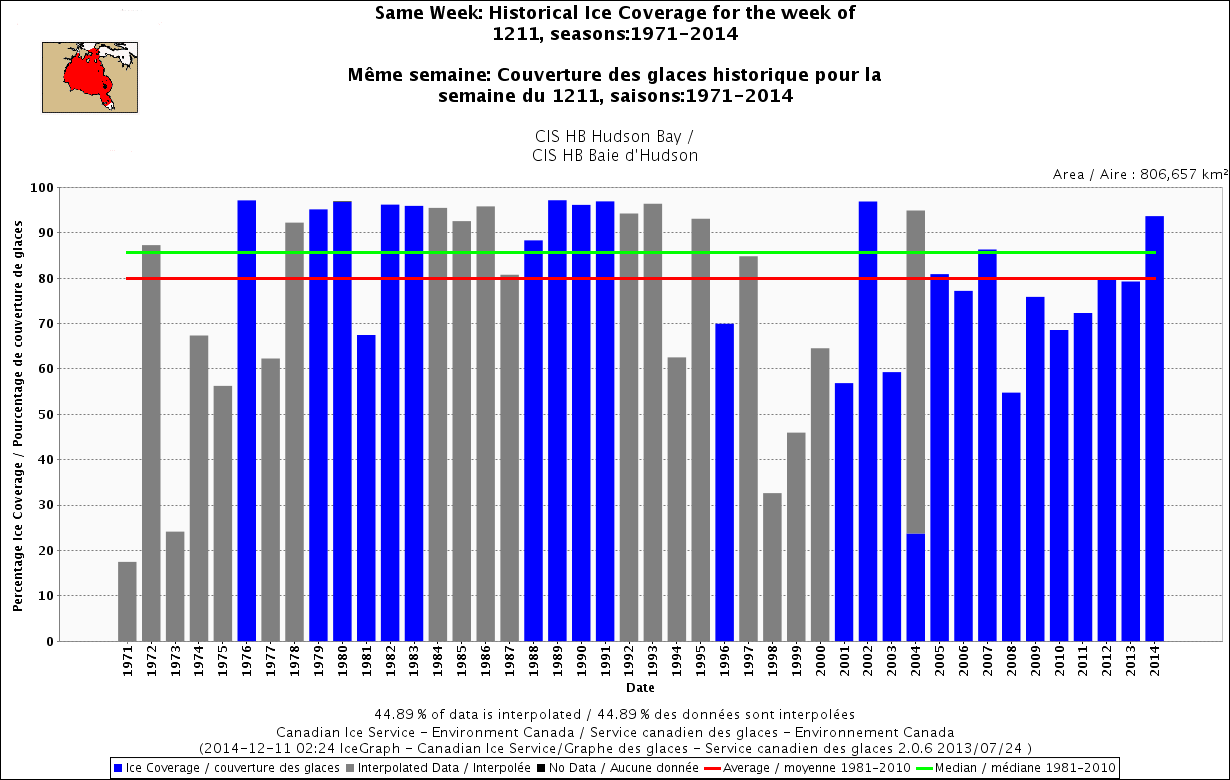
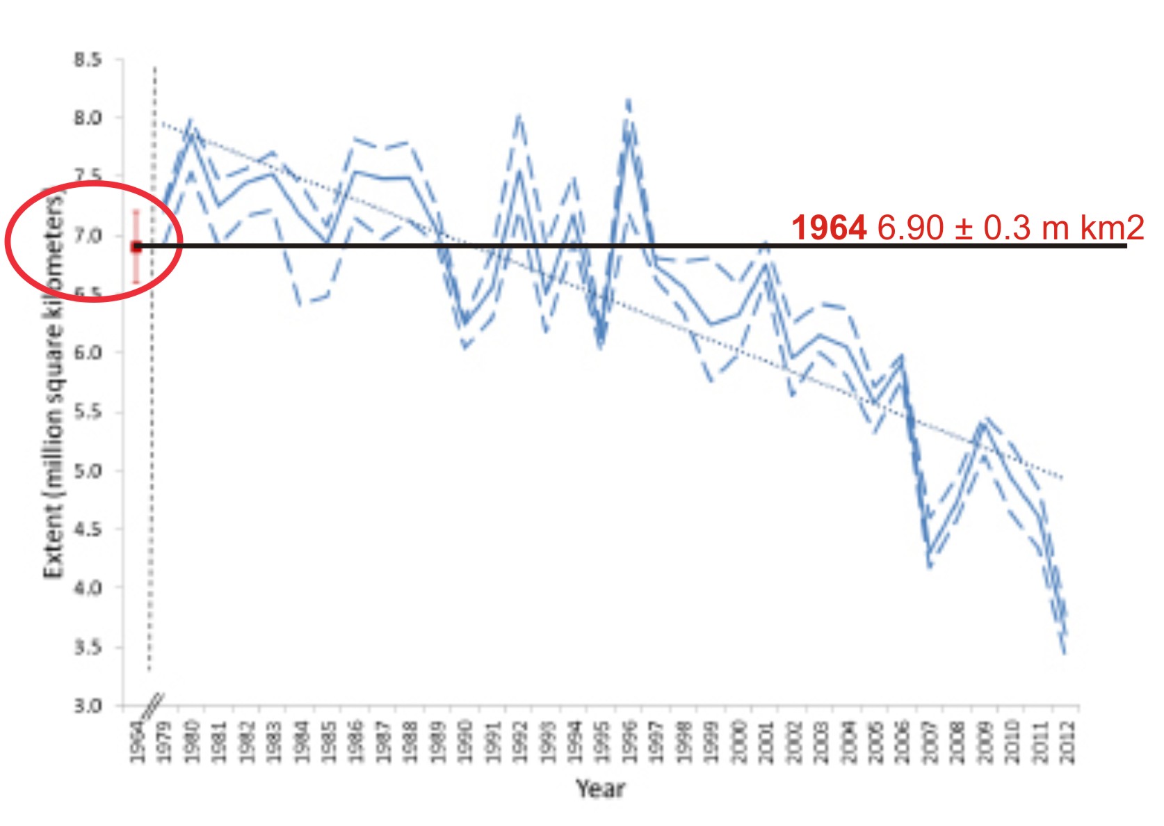
It seems that sea ice in Davis Strait is well above normal for this time of year – a recent announcement by the Canadian Ice Service (CIS) says it’s 10% above average, higher than it’s been in 25 years (h/t S. Goddard).

The Canadian Ice Service, an arm of Environment Canada, said there is 10 per cent more ice this year compared to the 30-year average.

We probably haven’t seen a winter this bad as far as ice for the past 25 years,” said Voight, referring to both the amount and thickness of the ice.

He said the Gulf of St. Lawrence is covered and some areas are “quite severe.” [my bold]

Full story here.

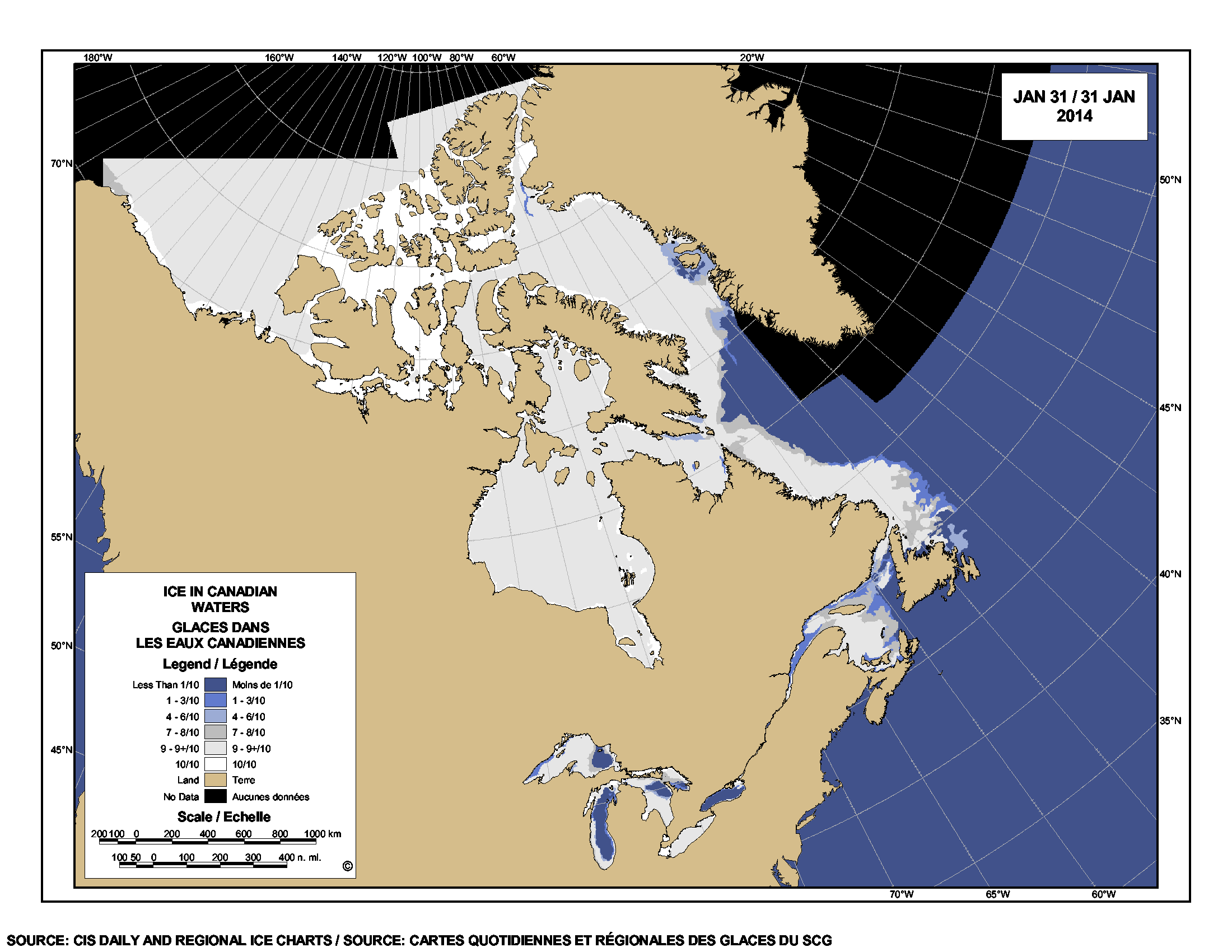
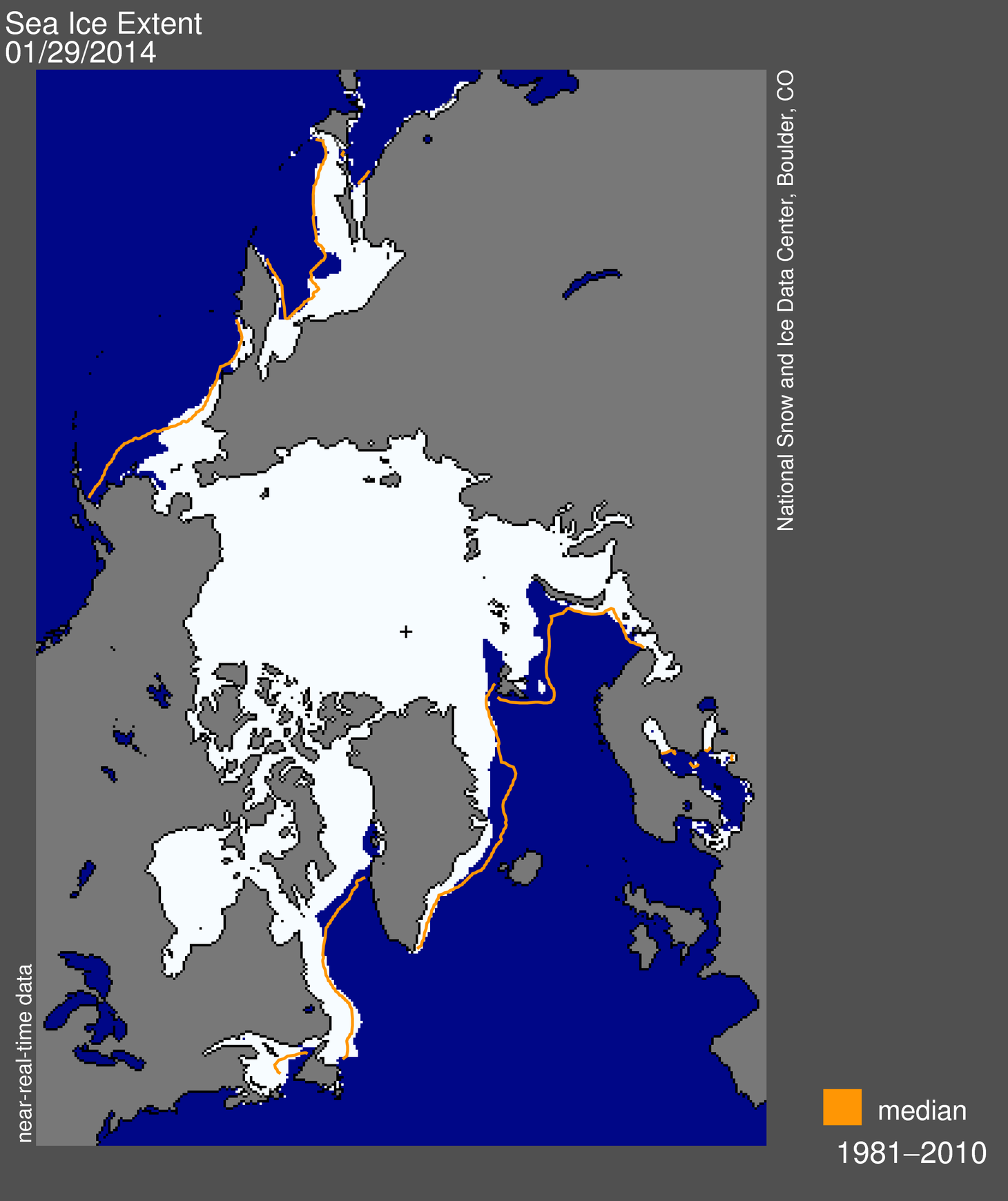
Latest ice map (March 12) below from the US National Snow and Ice Data Service (NSIDC).

As I pointed out recently here, Barents Sea ice is below average this year, largely due to natural variation in the Atlantic Multidecal Oscillation (AMO), but is higher over the western Atlantic (Sea of Okhotsk ice is below average too but there are no polar bears there).

There is lots of ice around Labrador and Newfoundland, however.

Sea ice extent 2014 March 12 NSIDC

I thought I let you see exactly what CIS are talking about: what did the ice look like 25 years ago, in 1989? What about 35 years ago, in 1979, the start of the satellite record for sea ice? It might surprise you. Continue reading

Polar bear habitat update – January 2014

Sea ice in the Arctic a bit below the 1981-2010 average for this date  but still within two standard deviations, with more ice than average off Canada — indicating we are still within expected natural variation, statistically speaking.

Remember that the National Snow and Ice Data Center (NSIDC) says this about standard deviation:

“Measurements that fall far outside of the two standard deviation range or consistently fall outside that range suggest that something unusual is occurring that can’t be explained by normal processes.”

Ice maps below, click to enlarge.

 Figure 1. Sea ice and lake ice concentration from the Canadian Ice Service (CIS) for 31 January, 2014. Note the amount of ice in the east, off Labrador (the “Davis Strait” polar bear subpopulation).


Figure 1. Sea ice and lake ice concentration from the Canadian Ice Service (CIS) for 31 January, 2014. Note the amount of ice in the east, off Labrador (the “Davis Strait” polar bear subpopulation).

Figure 2. Sea ice extent from the National Snow and Ice Data Center (NSIDC) for 29 January 2014. Note that the extent of ice in eastern Canada noted in Fig. 1 is slightly more than the 1981-2010 average (the orange line), while other areas have slightly less than average for this date. Compare ice growth over the last month to Fig. 3 below.

Figure 2. Sea ice extent from the National Snow and Ice Data Center (NSIDC) for 29 January 2014. Note that the extent of ice in eastern Canada noted in Fig. 1 is slightly more than the 1981-2010 average (the orange line), while other areas have slightly less than average for this date. Compare ice growth over the last month to Fig. 3 below.

Continue reading

NSIDC says the sea ice minimum in 1964 was not different from 1979, 1981, or 2001

I just came across the National Snow and Ice Data Center (NSIDC) “monthly highlights” article for April 2013 (Glimpses of sea ice past), which turned out to be a rather more interesting story than it appeared at first glance.

The article chronicles the details of how NSIDC technicians pieced together photos taken by the Nimbus 1 satellite between August 28 and September 23, 1964 – of both the Arctic and the Antarctic – to create an estimate of sea ice extent at September 1964 for both regions. For the Arctic, this was the yearly minimum; for the Antarctic, the yearly maximum.

NSIDC scientist Walt Meier was part of this effort and he and colleagues Gallaher and Campbell recently published their findings in the journal The Cryosphere (Meier et al. 2013). For the Arctic estimate, they had to add in data from Alaskan and Russian sea ice charts because the 1964 satellite data was not complete. This means the ice extent figure they came up with is not a true ‘satellite only’ figure but a composite one.

One of the things they did in their analysis was to place the 1964 value on a graph of the more recent 1979-2012 data, which really helps put it into perspective (see Fig. 1 below).

Figure 1. This is Fig. 7 from the Meier et al. 2013 paper, to which I’ve added labels. Meier et al. call this a “time series of Arctic September sea ice extent.” The estimate for 1964 is the red dot on the far left (with its error bars), which I’ve circled (I also added the red label for 1964 and the black line). Note the Y-axis on the left goes to 3.0 million km2, not zero. The solid blue line is the monthly average for September from passive microwave data (1979-2012), and the blue dashed lines are a “three-day average of the high and low range of daily extents during the month.” The 1964 estimate of 6.90 ± 0.3 million km2 is just about identical to 1979, 1981, and 2001 and well within the average for 1979-2000. However, it’s significantly lower than the previous estimate of 8.28 million km2 for 1964 made by the UK Hadley Centre in 2003 (Meier et al. 2013:704).

Figure 1. This is Fig. 7 from the Meier et al. 2013 paper, to which I’ve added labels. Meier et al. call this a “time series of Arctic September sea ice extent.” The estimate for 1964 is the red dot on the far left (with its error bars), which I’ve circled (I also added the red label for 1964 and the black line). Note the Y-axis on the left goes to 3.0 million km2, not zero. The solid blue line is the monthly average for September from passive microwave data (1979-2012), and the blue dashed lines are a “three-day average of the high and low range of daily extents during the month.” The 1964 estimate of 6.90 ± 0.3 million km2 is just about identical to 1979, 1981, and 2001 and well within the average for 1979-2000. However, Meier and colleagues note it is significantly lower than the previous estimate of 8.28 million km2 for 1964, made by the UK Hadley Centre in 2003.

Continue reading