Tag Archives: NSIDC

What polar bear habitat could look like in another 5-6 weeks

According to the National Snow and Ice Data Center (NSIDC, Sept. 20 report), the annual sea ice minimum extent was reached on Sept. 13, 2013.

At 5.10 million square kilometers, this year’s low was a whopping 1.69 million square kilometers above the minimum extent for 2012 (which was the lowest since 1979) and well within two standard deviations of the 1979-2010 average. (Two standard deviations: “Measurements that fall far outside of the two standard deviation range or consistently fall outside that range suggest that something unusual is occurring that can’t be explained by normal processes”).

The minimum extent for 2013 is virtually indistinguishable from the minimum for 2009, which was 5.13 million square kilometers. The ice was distributed a bit differently in 2009 – more in the east and less in the west — than it was this year (see Fig. 1 below).

Figure 1. Using the JAXA “Sea ice monitor” feature, I plotted the date the 2013 minimum was reached (September 13, 5.10 million square kilometers, white) with an overlay (purple) for the same date back in 2009 (September 13, 2009, 5.13 million square kilometers), when that year’s minimum was reached (according to the NSIDC report). Areas of overlap are pink.

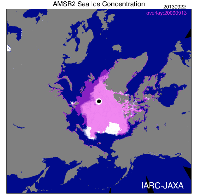
Figure 1. I used JAXA to plot the date the 2013 minimum was reached (September 13, 5.10 million square kilometers, white) with an overlay (purple) for the same date back in 2009 (September 13, 2009, 5.13 million square kilometers), when that year’s minimum was reached. Areas of overlap are pink.

You’ll know from previous discussions here that the annual minimum reached in late summer has little impact on polar bear health and survival (see excellent summary of the evidence for that here). What matters most to polar bears is the presence of ample ice in spring and early summer (March-June), which is their critical feeding period.

But after the fast that many polar bears endure over the height of the summer, they are eager to get back onto the ice and resume hunting. When in the fall does that become possible?

I wondered what the similarity in extent for 2013 and 2009 might tell us about polar bear habitat development over the next month or so.

In other words, what might polar bears this year expect in the way of sea ice development by say, the end of October? When might they be able to start hunting?

Continue reading

Chukchi-Beaufort ice extent comparison – why feature only the last 7 years?

The most recent issue of Arctic Sea Ice News provided by the National Snow and Ice Data Center (NSIDC) – the official US keeper of sea ice data – (July 17, 2013) included an interesting graph of sea ice extent in the Chukchi and Beaufort Seas at July 12.

They present the data for 2007 to 2013, compared to the new 30 year average1, and note that the Beaufort Sea had “the most extensive ice cover seen there in the last seven summers.” It is also clear from their graph that the 2013 extent was virtually identical to the average in both regions (Fig. 1).

Figure 1. Graph of sea ice extent at July 12 each year from 2007 to 2013 from the National Snow and Ice Data Center, NSIDC. “Climatology” (last set of bars) is the 30 year average (1981-2010) extent at this date.1 In 2013, the Beaufort Sea had “the most extensive ice cover seen there in the last seven summers” (NSIDC). It is also clear from the graph that the 2013 extent was virtually identical to the 30-year average. Map from Wikipedia. Click to enlarge.

Figure 1. Graph of sea ice extent at July 12 each year from 2007 to 2013 from the National Snow and Ice Data Center, NSIDC. “Climatology” (last set of bars) is the 30 year average (1981-2010) extent at this date.1 It is clear from the graph that the 2013 extent was virtually identical to the 30-year average. Map from Wikipedia.

What puzzled me was why they featured only the last 7 years when satellite data go back to at least 1979. Is there something in that data they don’t want us to see?

There is no similar data in graph form available that I could find but there is the wonderful comparative sea ice mapping tool provided by Cryosphere Today, operated by the University of Illinois.

So, in the absence of numerical data to compare to the Fig. 1 graph, I chose visual data to ask the question: what could there be about the long-term record of Chukchi/Beaufort sea ice data that the NSIDC might not want us to know?

The ice coverage at mid-summer (July 12) provides a snapshot of what sea ice  conditions are like for polar bears before the summer melt season gets into full swing, so this historical perspective is quite revealing. [See previous posts here, here, and here for more on Chukchi/Beaufort polar bears.]
Continue reading

NSIDC says the sea ice minimum in 1964 was not different from 1979, 1981, or 2001

I just came across the National Snow and Ice Data Center (NSIDC) “monthly highlights” article for April 2013 (Glimpses of sea ice past), which turned out to be a rather more interesting story than it appeared at first glance.

The article chronicles the details of how NSIDC technicians pieced together photos taken by the Nimbus 1 satellite between August 28 and September 23, 1964 – of both the Arctic and the Antarctic – to create an estimate of sea ice extent at September 1964 for both regions. For the Arctic, this was the yearly minimum; for the Antarctic, the yearly maximum.

NSIDC scientist Walt Meier was part of this effort and he and colleagues Gallaher and Campbell recently published their findings in the journal The Cryosphere (Meier et al. 2013). For the Arctic estimate, they had to add in data from Alaskan and Russian sea ice charts because the 1964 satellite data was not complete. This means the ice extent figure they came up with is not a true ‘satellite only’ figure but a composite one.

One of the things they did in their analysis was to place the 1964 value on a graph of the more recent 1979-2012 data, which really helps put it into perspective (see Fig. 1 below).

Figure 1. This is Fig. 7 from the Meier et al. 2013 paper, to which I’ve added labels. Meier et al. call this a “time series of Arctic September sea ice extent.” The estimate for 1964 is the red dot on the far left (with its error bars), which I’ve circled (I also added the red label for 1964 and the black line). Note the Y-axis on the left goes to 3.0 million km2, not zero. The solid blue line is the monthly average for September from passive microwave data (1979-2012), and the blue dashed lines are a “three-day average of the high and low range of daily extents during the month.” The 1964 estimate of 6.90 ± 0.3 million km2 is just about identical to 1979, 1981, and 2001 and well within the average for 1979-2000. However, it’s significantly lower than the previous estimate of 8.28 million km2 for 1964 made by the UK Hadley Centre in 2003 (Meier et al. 2013:704).

Figure 1. This is Fig. 7 from the Meier et al. 2013 paper, to which I’ve added labels. Meier et al. call this a “time series of Arctic September sea ice extent.” The estimate for 1964 is the red dot on the far left (with its error bars), which I’ve circled (I also added the red label for 1964 and the black line). Note the Y-axis on the left goes to 3.0 million km2, not zero. The solid blue line is the monthly average for September from passive microwave data (1979-2012), and the blue dashed lines are a “three-day average of the high and low range of daily extents during the month.” The 1964 estimate of 6.90 ± 0.3 million km2 is just about identical to 1979, 1981, and 2001 and well within the average for 1979-2000. However, Meier and colleagues note it is significantly lower than the previous estimate of 8.28 million km2 for 1964, made by the UK Hadley Centre in 2003.

Continue reading

Not much has changed in polar bear country since the sea ice maximum

I’ve been busy with work-related activities lately and will be for several more weeks. Until then…

Sea ice changes since March 15 [Update added May 10, see below]

Lots of ice everywhere – even in Hudson Bay. A bit less ice in the Barents Sea (north of Norway) than there was two months ago at the sea ice maximum March 15 (see Fig. 1 below compared to the extent at May 5 in Fig. 2: both from NSIDC). But there is still quite a bit around Svalbard – that group of islands between NE Greenland and NW Norway (see Fig. 3 below a MASIE image, where this situation is more apparent).

Polar bears are eating and mating at this time of year (early May being the tail-end of the season in most areas) – and right now, they have a huge, circumpolar ice platform for those activities.

Continue reading

Sea ice maximum reached March 15: what it means for polar bears

On Monday, March 25, the National Snow and Ice Data Center (NSIDC) announced that March 15 2013 was likely the maximum extent reached this winter. Note that just a few days ago, I discussed the relationship between maximum extent of sea ice and the global distribution of polar bears around the Arctic (see March 20th post here).

NSIDC says: “Arctic sea ice extent on March 15 was 15.13 million square kilometers (5.84 million square miles). The orange line shows the 1979 to 2000 median extent for that day. The black cross indicates the geographic North Pole.”

NSIDC says: “Arctic sea ice extent on March 15 was 15.13 million square kilometers (5.84 million square miles). The orange line shows the 1979 to 2000 median extent for that day. The black cross indicates the geographic North Pole.” Click to enlarge.

Continue reading

The sea ice is back and polar bears are heading out

It appears from the ice maps that most of the polar bears throughout the world that have chosen to remain on land during the late summer and fall (about July/August through October/November) can now return to the ice.

I can tell most of this tale with maps, so I will.

Continue reading